Design Systems
Problem
Solution
Role
Tools
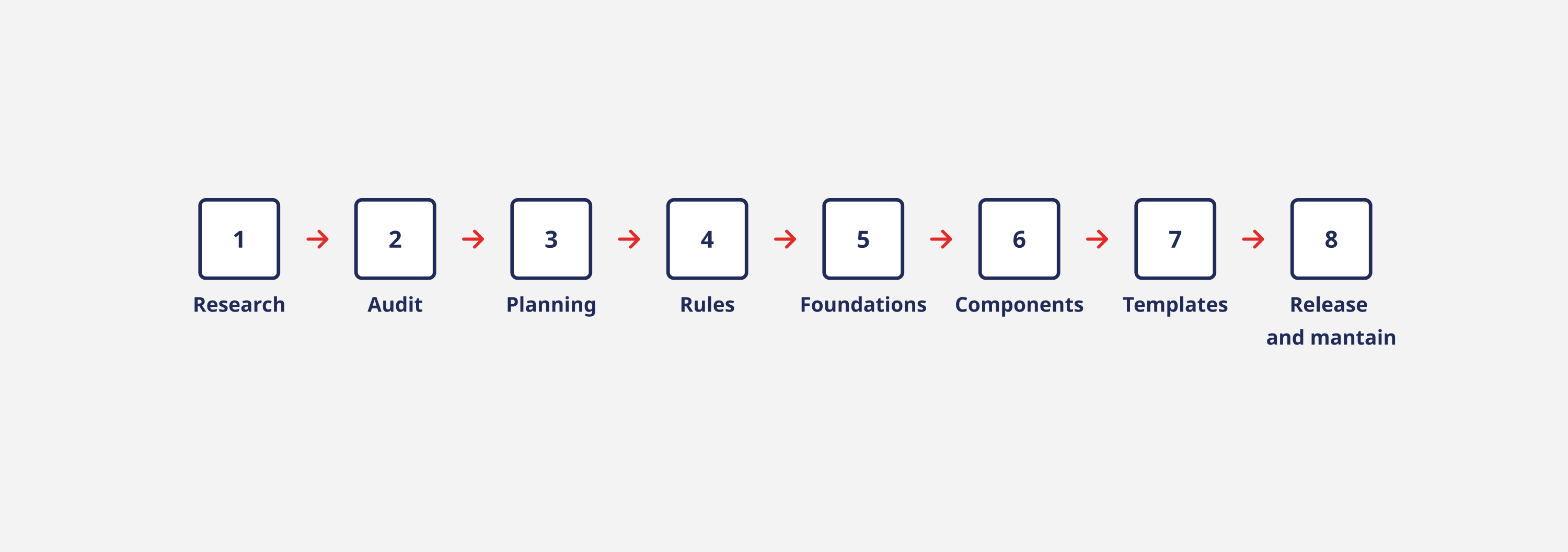
Tasks
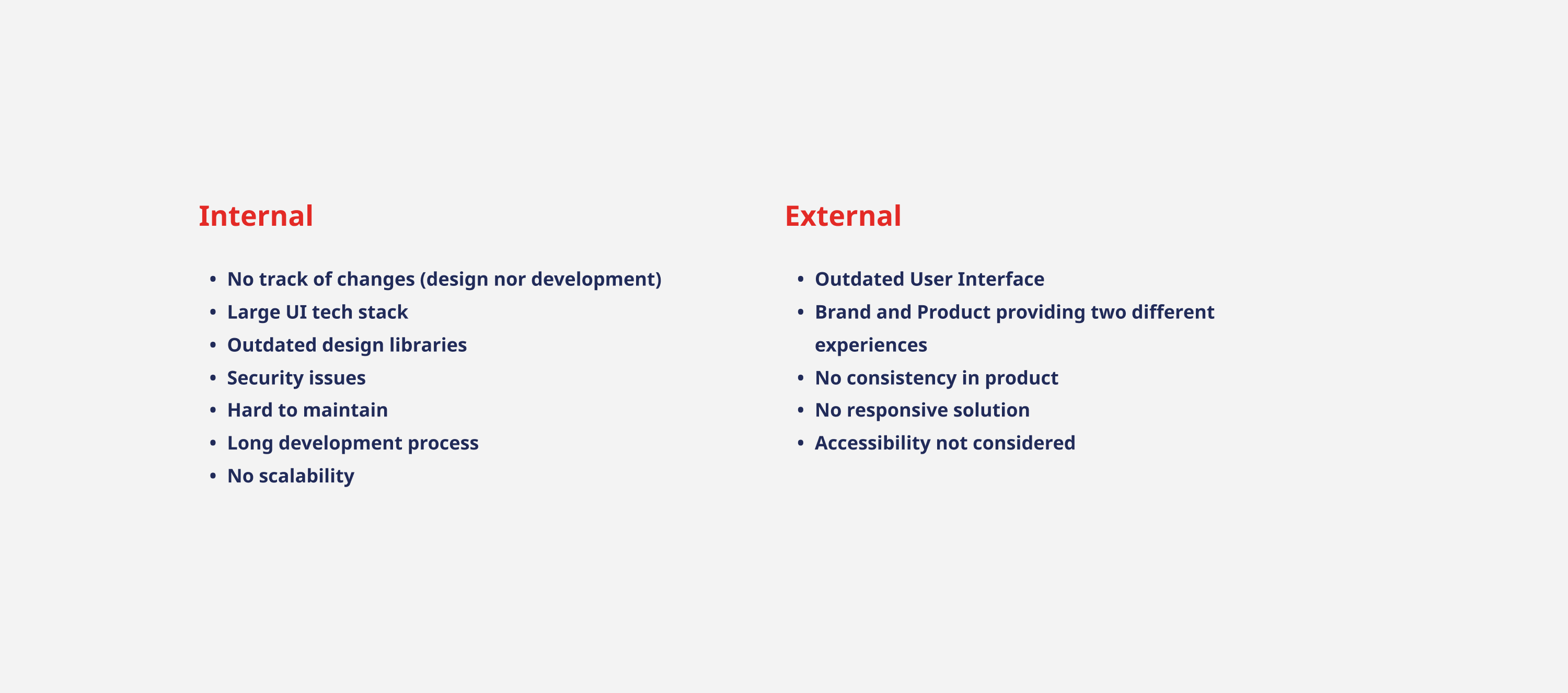
By interviewing internal (Engineers, Designers, Product Managers and Salespeople) and external stakeholders, I gather the following issues that were hindering the experience.
To kick off the project, I needed to gain buy-in from various stakeholders including product managers, designers, VPs of product, and engineering.
How did I do it? I organized multiple meetings to highlight the value of implementing a Design System, I created several presentations to communicate the project's concept and objectives effectively.
I conducted a thorough audit to catalog all existing elements, including foundations, components, patterns, and icons.
Findings:
Established a centralized team dedicated to supporting the system and making decisions for other teams. Implemented a sprint-based workflow where I, as a designer, evaluated component needs, designed them in Figma, tested with other designers, and oversaw development and implementation.
The team included:
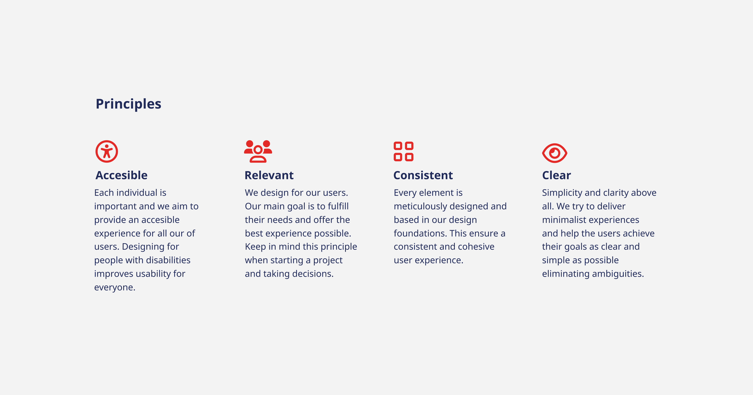
Defined design principles, tools, programming languages, documentation, terminology, and accessibility guidelines.
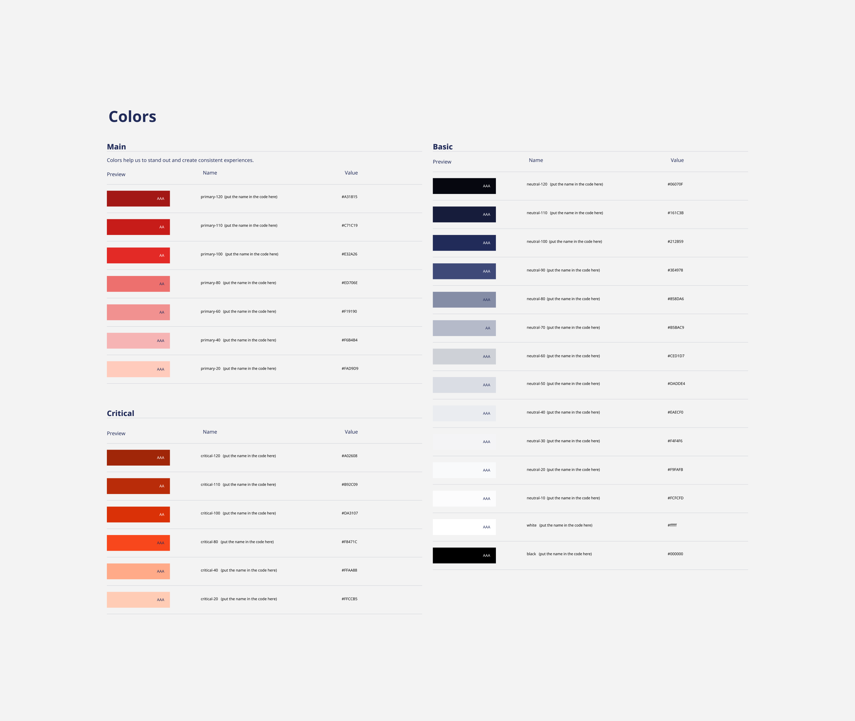
Collaborated with our marketing team to integrate new brand guidelines into the design foundations.Defined system elements such as colors, typography, elevations, icons, motions, and breakpoints.
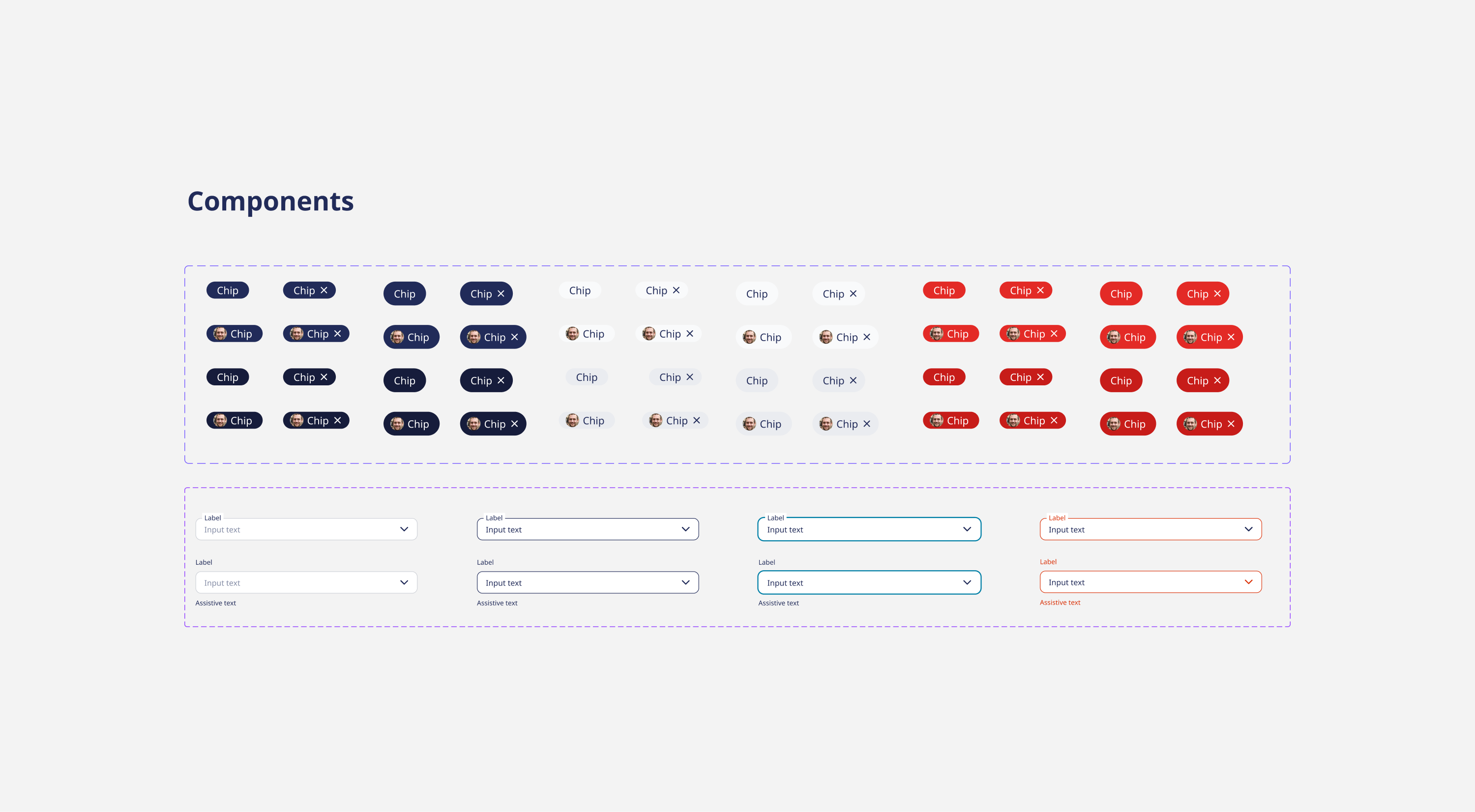
Most components were custom-made and coded internally, with more complex ones built using existing libraries.Ensured accessibility and ease of use for all components, including buttons, inputs, checkboxes, and modals.
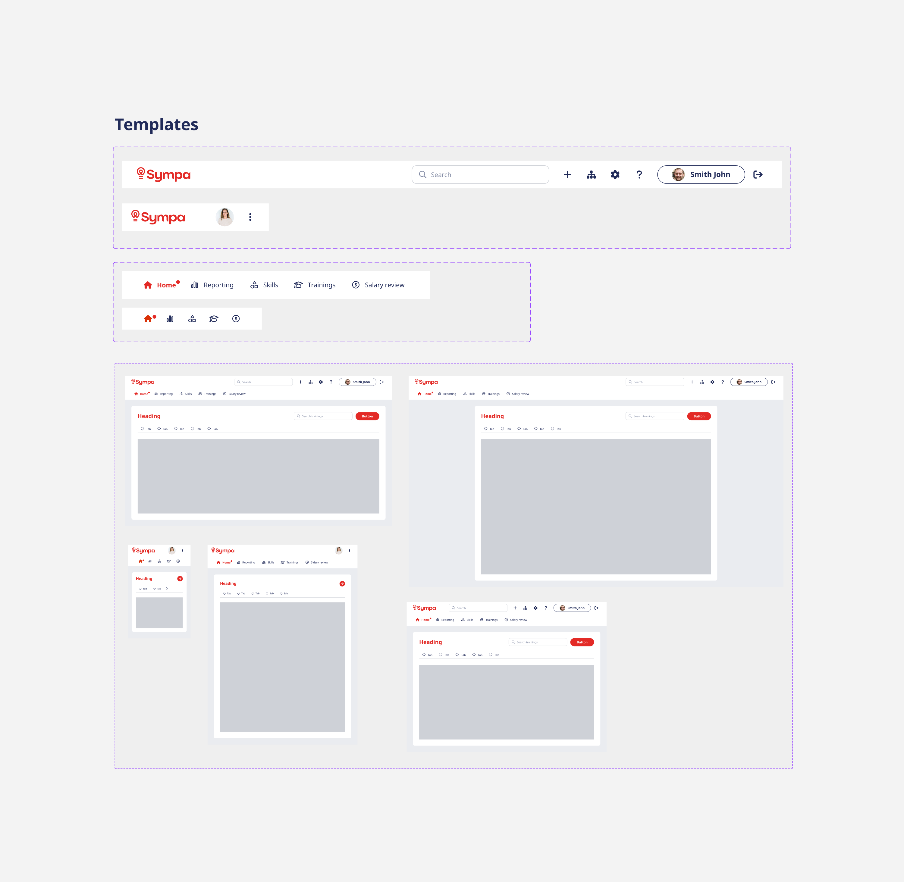
Created various templates and patterns to streamline the design process for our team.
Focused on encouraging adoption and analyzing component usage.
Released Version 1.0 of the system, including tokens and 15 core components, with ongoing improvements.
Established a clear structure for components in Figma, leading to adoption by three different teams.


